‹Behind the Scenes›
Here is a small documentation of how I apply design thinking into the creation of this microsite.
Step 1: Empathise
Who are the target audiences? What is it that they want to know? What is the purpose of this site?
Potential recruiter:-
Know more about who I am and whether I am suitable for the job
- Any past work experiences?
- Contact details and other platforms that I am on
- Having to go through multiple candidate portfolios can cause weariness
- A representation of myself
- A place for others to get to more about me
Step 2: Define
Analysing information gathered from step 1 to define problems that need to be solved, and what should be prioritised:
- Portfolio should represent who I am and demonstrate the technical and soft skills I possess as these are some factors potential recruiters look for when searching for a suitable job candidate.
- Portfolio should be simple and easy to navigate around as recruiters are often fatigue after looking through numerous portfolios.
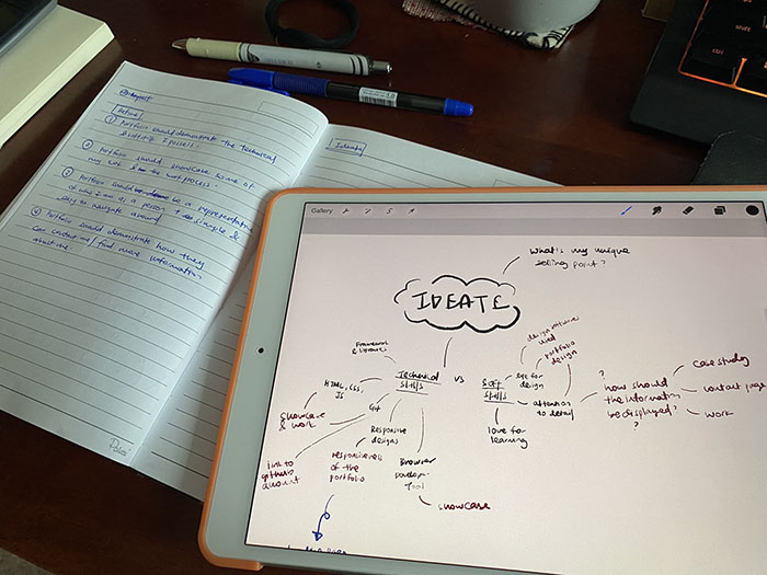
Step 3: Ideate
Problems defined previously served as the anchor on how the portfolio should be designed and the types of features required:
Firstly, how can the audiences know more about my technical and soft skills?-
Exhibit past projects
- Information like the technologies used for each project and the links to both the repository and live site should be included
-
A table that display all technical skills
- To be found on the main landing page
- Link audiences to other platforms that they can find me on
- Took inspiration from social buttons that can be found on many sites that brings users to their social media platforms
- Platforms to be included: LinkedIn, GitHub, Twitter
- Using customised fonts and hand-drawn illustrations to give a personal touch to the portfolio
-
Using of rounded corners to excude a welcoming and harmonious
energy
- for elements like buttons, borders, etc
-
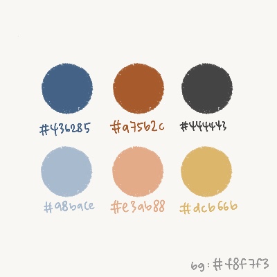
Create a colour palette that can create a brand identity
- Having blue as the primary colour (my favourite color)
- Should include some shades of orange to excude playful and positive energy

- Past projects can be displayed in a card form to create an organised structure that is easy to understand
- as the portfolio consists of multiple subpages, there should be a way to inform users about the page they are at

Step 4: Prototype
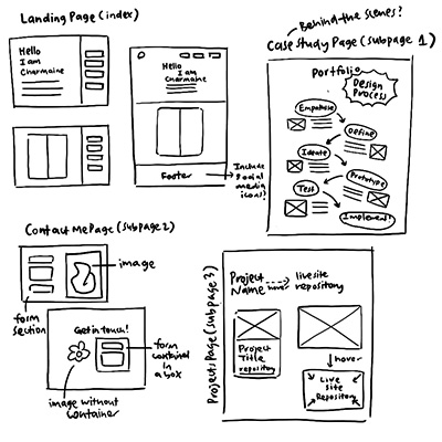
- Sketches were created to explore the different ways of displaying information

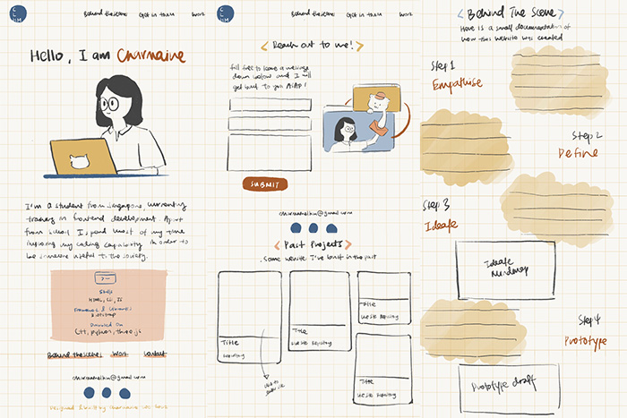
- A low-fidelity prototype was then drawn to test out feasibility of the design

Step 5: Test and Implementation
Continuous testing done throughout the building of portfolio to ensure its usability
Some items that were only implemented after the implementation phase include:- "Home" tab on the navigation bar that allows users to return to the landing page easily
- "Return to top" button as a shortcut for users to go back to the top of the page if they want to explore other sub-pages